
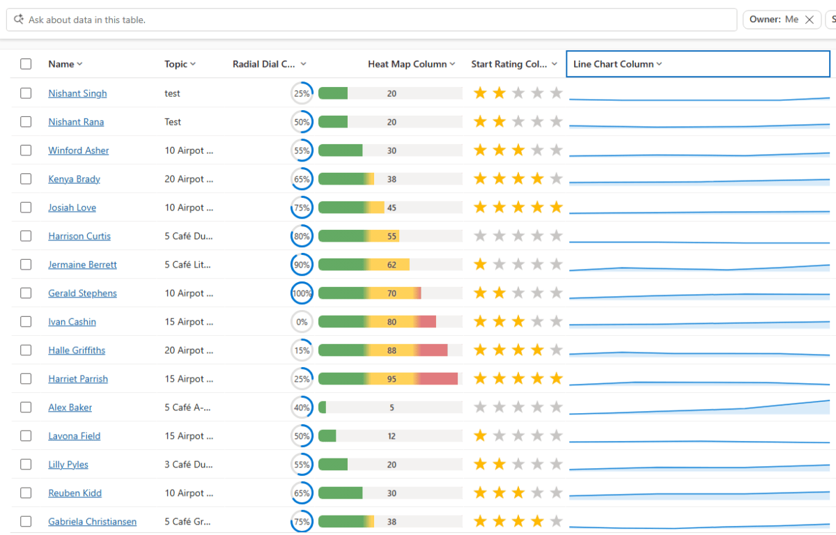
Power Apps now lets us render a column’s data as a small graphic in the grid – a gauge, a sparkline, a colored bar, or stars – instead of plain text. We tried it out on a couple of our own columns, and here’s a quick step-by-step on how to set it up, along with the data format each visualization expects.
This is a preview feature, so it’s best tried out in Dev/Sandbox for now rather than rolled out to production grids.
Pick a Visualization for the Column
- Sign in to Power Apps (make.powerapps.com) → Solutions → open the table.
- Open the column to edit (or create a new one).
- Expand Advanced options → “Visualization”.
- Select one of: Heat Map, Line Chart, Radial Dial, Star Rating.
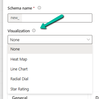
- Save. Every grid or view showing that column now shows the graphic automatically.
That’s it – it’s a one-time setting on the column, not something you configure per view.
Know What Data Each One Expects
This is the part that actually matters – each visualization is strict about the shape of the data behind it.
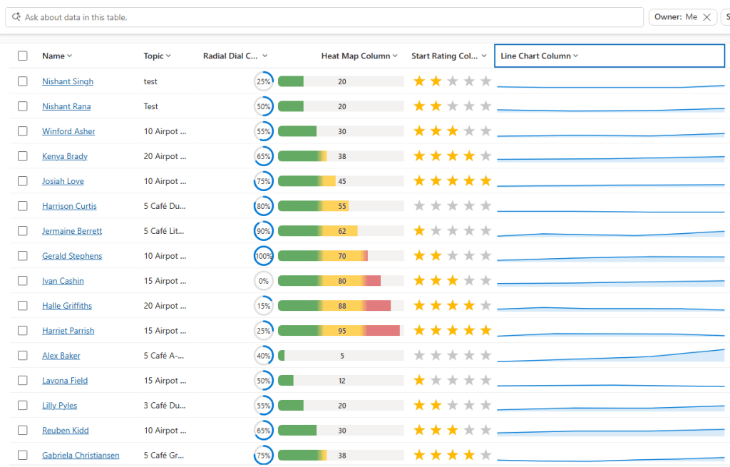
Radial Dial: expects a single value, 0–100. Example: 60 → ring 60% full.
Heat Map: expects a single value, 0–100 by default. Example: 90 → bar colored red (high).
Star Rating: expects a value from 0 to the star count, 5 by default. Example: 3 → three stars filled.
Line Chart: expects comma-separated numbers, 100 characters maximum length. Example: 10,20,30,45 → a trend line.
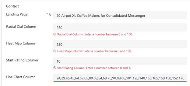
For .e.g the data for these columns –
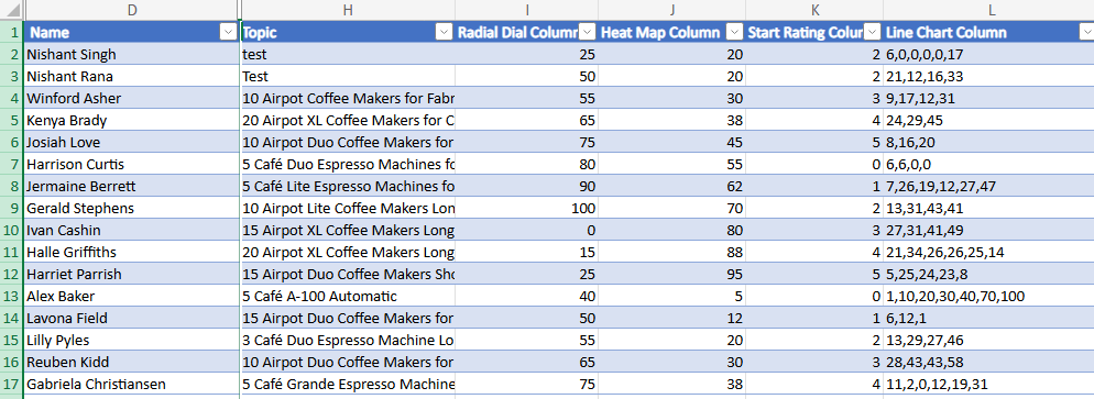
Below is how they are rendered in a view.
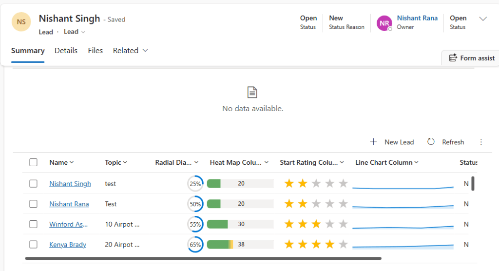
And this is as a subgrid.
Key Takeaway
Set the visualization once on the column, keep the underlying data clean (0–100 for Radial Dial/Heat Map, comma-separated numbers for Line Chart, 0 to 5 for Star Rating), and every grid using that column just works. Most issues we ran into came down to one thing – the value wasn’t stored the way the visualization expected.
Get all the details here: Column visualizations for grids in Power Apps
Hope it helps..
Discover more from Nishant Rana's Weblog
Subscribe to get the latest posts sent to your email.
Share It -


 Nishant Rana's Weblog