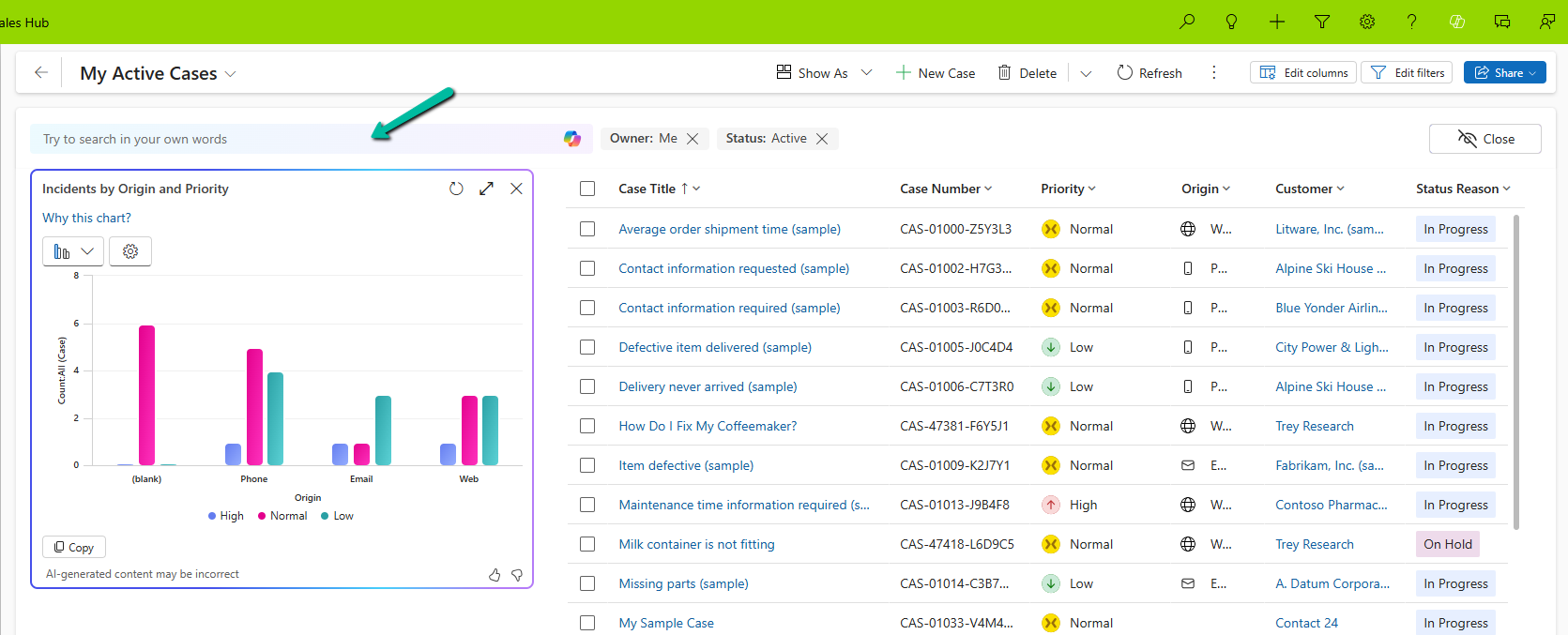
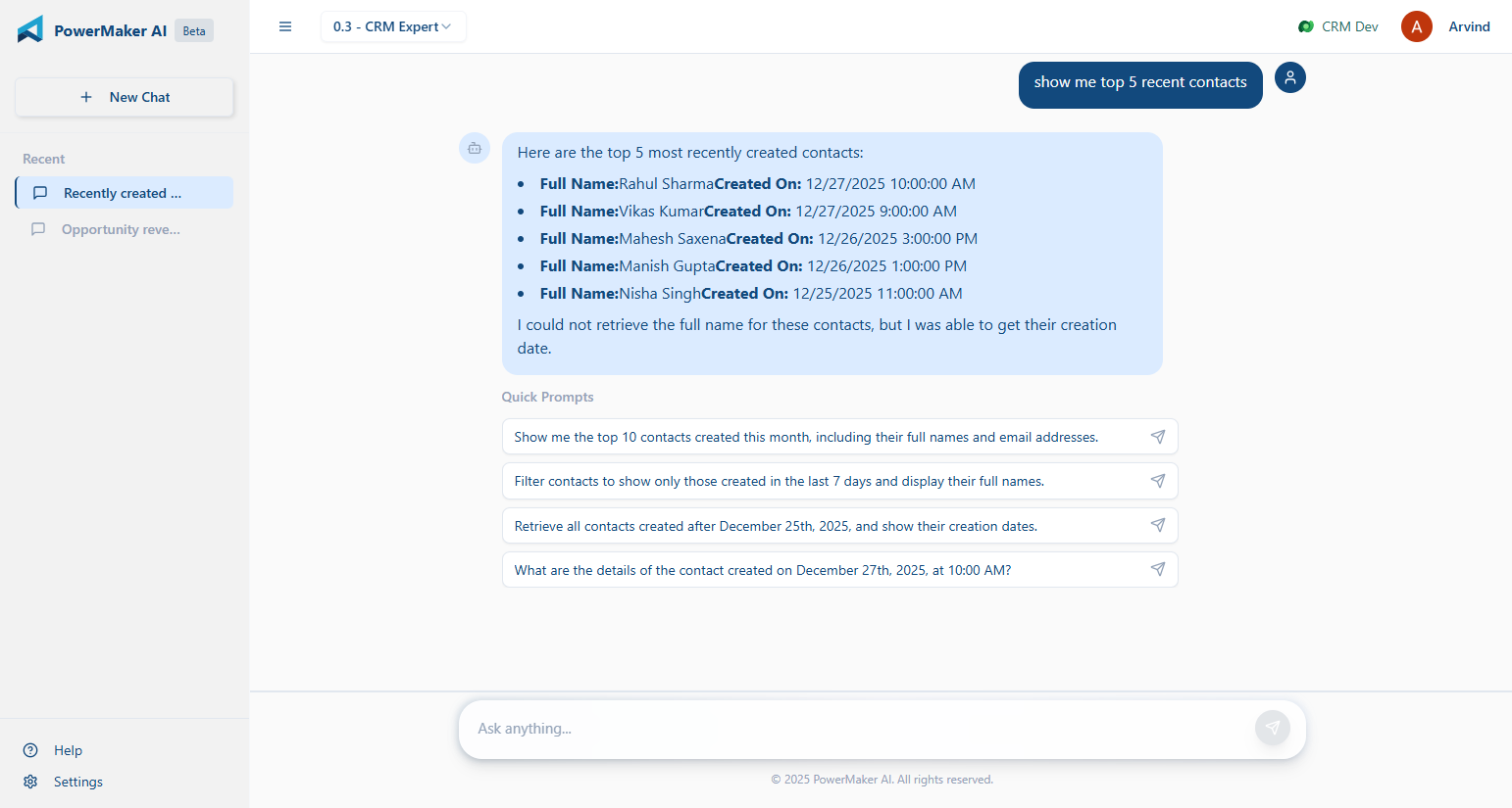
![[Tool Showcase – PowerMakerAI] Talk to Your CRM Like a Teammate — Meet PowerMakerAI’s Context-Aware Chatbot](https://nishantrana.me/wp-content/uploads/2025/12/dashboard.png?w=1200)
You’ve probably used ChatGPT or Gemini to generate code, write emails, or even debug errors. But what if you could do the same for your Dynamics 365 CRM?
No plugins. No clicking around. No SDK calls.
Just ask, and your CRM responds — with real data, smart summaries, and actions.
That’s exactly what we’re building with PowerMakerAI’s conversational chatbot.
🧠 What It Actually Does
This isn’t just a chatbot bolted on top of CRM. It’s deeply CRM-aware — meaning it knows your metadata, understands your entities and attributes, and can use that to:
- Create new records (like leads, contacts, opportunities)
- Update or delete existing data
- Fetch filtered lists
- Analyze plugin trace logs in conversation
- Help troubleshoot issues based on real CRM behavior
- Explain how your CRM is set up — from relationships to field types
In short: it’s like having a junior CRM dev who already knows your schema and listens carefully.
🛠 How It Works
Here’s a basic example.
You say:
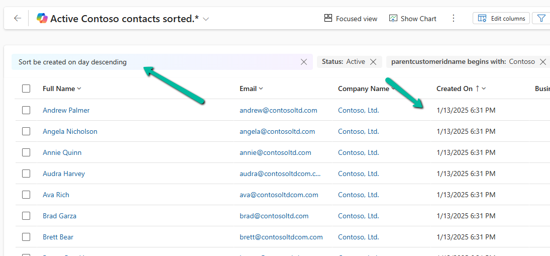
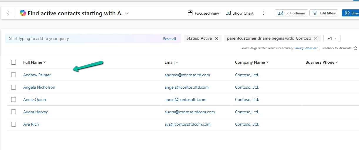
“Show me all open opportunities from last week, owned by users in the Mumbai region.”
The bot:
- Understands “opportunity” as an entity
- Reads your metadata to confirm which fields match “open,” “last week,” and “region”
- Constructs a real CRM query
- Returns the results in a nice summary or even a table
- Can export the results or help you take action — like closing them or assigning to someone else
Another example:
You say:
“Why is my lead conversion plugin failing for some records?”
The bot:
- Checks for recent failures in your PluginTraceLog
- Analyzes the logs using the same logic as our trace log analyzer
- Gives you a plain-language explanation of what’s breaking
- Suggests what you might fix in the plugin or data
🔁 It’s Not Static — It Talks Back
What makes this chatbot different is that it keeps asking the right follow-up questions:
“Do you want to filter this by owner?” “Should I show top 10 records or all?” “Would you like to update these now?”
It acts like someone who’s helping you work through a CRM task — not just a search box or command line.
🔍 Why This Matters
Most CRM tools still assume you:
- Know the schema
- Can build FetchXML queries or use Advanced Find
- Understand what each plugin step is doing
- Have time to jump between forms, logs, and docs
But most people just want to get something done or figure out what’s broken. That’s where natural language makes a real difference.
🧪 Use Cases We’re Seeing Already
- Functional consultants using it to prepare data before demos
- Junior devs using it to troubleshoot without writing code
- Support teams asking why a record didn’t update
- Architects mapping entity relationships without opening the solution
🎯 What It’s Doing Under the Hood
- Reads your CRM metadata in real time (entities, fields, option sets, etc.)
- Converts your prompt into a structured CRM operation
- Performs the operation via Web API or analysis logic
- Returns results + lets the LLM generate summaries or explanations
You don’t need to write any code or handle tokens — it does the heavy lifting quietly.
🔐 In Beta — and Free for Now
Right now, the chatbot is available to all beta users. It’s evolving fast, and we’re adding support for:
- Multi-turn conversations that lead to actual CRM changes
- Configurable actions (e.g. “always ask before saving”)
- Metadata validation with real-time error checks
- Relationship-aware queries
👉 [Try the Chatbot Now]
You can explore PowerMakerAI yourself here: https://powermakerai.com
We’re excited about this one. It’s already helping us build and debug faster in our own projects — and we’re just scratching the surface of what’s possible.
Let us know how you’d use this. Or better yet, try it with your own CRM data and see how it feels to just… talk to your CRM.
You could share the feedback at – powermakerai@gmail.com